Ways to create a dashboard
-
Manual: Open a new report, and click the top right Dashboard button to open the dashboard canvas.
The canvas is a visual grid, where you can add/remove widgets, resize and move them in the canvas area.
- You can add visuals that are were created in left chat pane.
- You can add text widgets via the plus button at the top
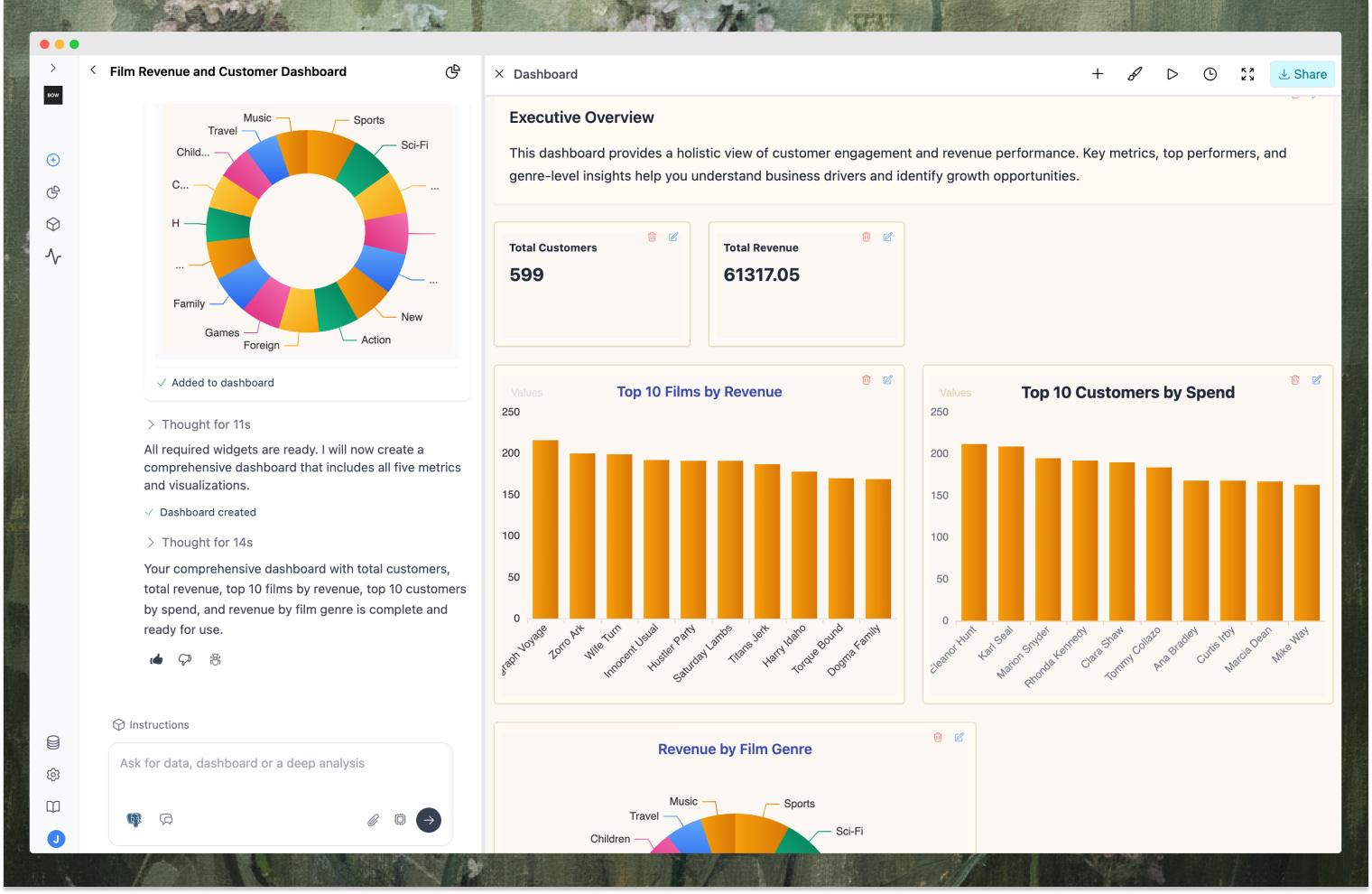
- AI Generated: Simply type in chat, “Create a dashboard about …” to initiate the process. Watch as the dashboard takes shape in real-time, with blocks being added progressively. Once complete, the dashboard will display a polished layout and narrative text. Feel free to rearrange or modify any elements as needed.
The Canvas
-
Drag & drop layout
- Move items where you want them; resize to fit the content.
- Items snap cleanly into a grid and won’t overlap.
-
Add and edit content
- Visualizations: Add charts/tables tied to your queries.
- Text widgets: Write headings, explanations, insights, lists, and links.
-
Remove
- Use the item controls to remove a visualization or text block.
-
Fullscreen
- Open a distraction‑free view for reviews or presentations.
-
Themes
- Choose a theme to set background, text, and card styling; updates apply instantly.
-
Share
- Share a dashboard link with teammates so everyone sees the same layout and visuals.
-
Schedule
- Set dashboards to refresh and send automatic updates (e.g., periodic email summaries).
Editing Visualizations
-
Choose a chart type
- Bar, line, area, pie, scatter, heatmap, candlestick, treemap, radar, table, count.
-
Map your data
- Pick the category (x‑axis or grouping), values/series, or x/y fields depending on the chart.
- Helpful suggestions appear based on your data.
-
Style and options
- Toggle titles, legends, axes, and grid lines.
- Adjust label rotation and spacing for readability.
- Set variants (e.g., smooth/area) and custom style options (colors, borders).
-
Apply vs Save
- Apply: Updates the current view.
- Save: Persists the visualization so it stays consistent across the dashboard.
Tips for Great Dashboards
- Start with a title and summary to frame the story.
- Group related visuals side‑by‑side; keep a logical flow left‑to‑right, top‑to‑bottom.
- Use text to explain the “so what” near each visual.
- Balance sizes: smaller for KPIs, medium for trend lines, larger for dense tables or multifaceted charts.
- Pick readable themes and rotate labels when categories are long.
- Iterate with AI: ask it to add missing context, alternate views, or better layout ideas.